Lively Theme
Lively Theme allows you to add header, footer, and custom menus and let’s you customize your dashboard, space homepages and other pages with attractive widgets.
Enabling Lively Theme
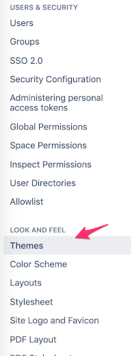
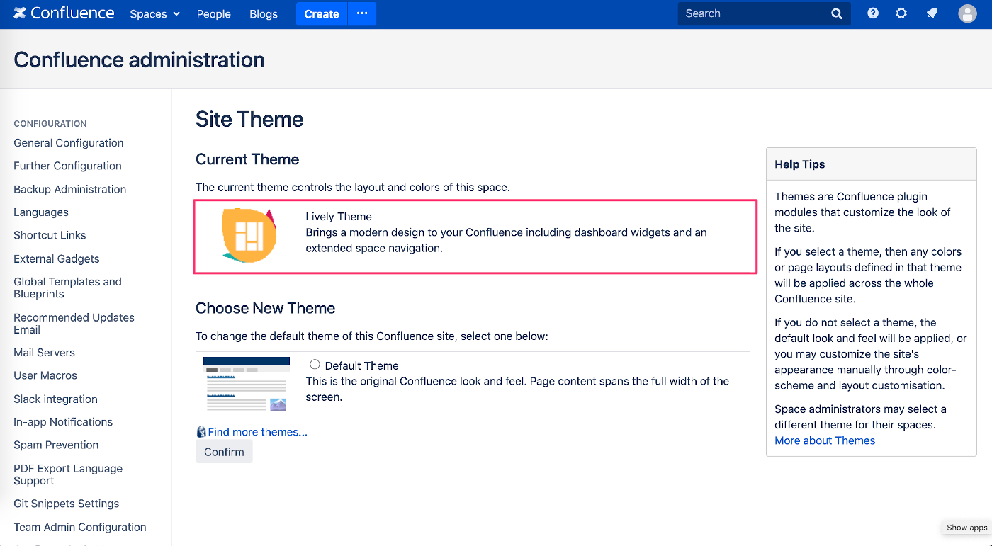
In order to use Lively Theme elements, Lively Theme must be enabled in the global Confluence theme settings. Go to the Confluence Administration → Look and Feel / Themes, then select Lively Theme and confirm.
Custom Elements
The custom dashboard, header, footer, menu and submenu are called custom elements in Lively Theme. These can be separately enabled or disabled in the Lively Theme settings.
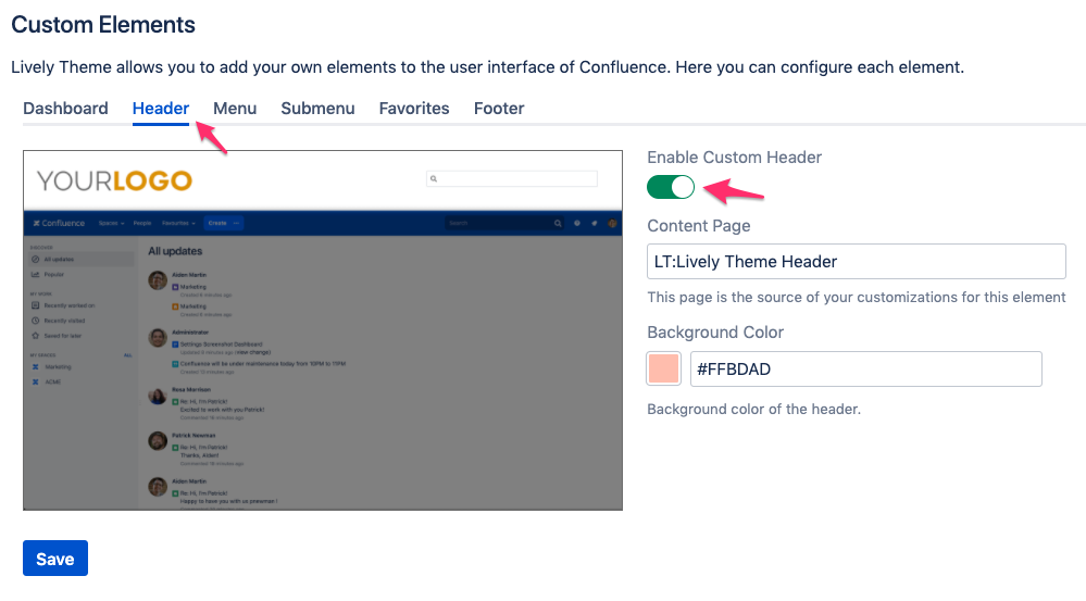
Enabling Custom Elements
Go to Administration → Lively Theme → Settings and check the custom elements you want to enable for your Confluence instance. Then click Save at the bottom. (The below screenshot shows how you would configure the Header custom element.)
Editing Custom Elements
To edit custom elements, go to a page where you see the element, for example the dashboard, and click on the edit icon in the top right corner of the particular element.
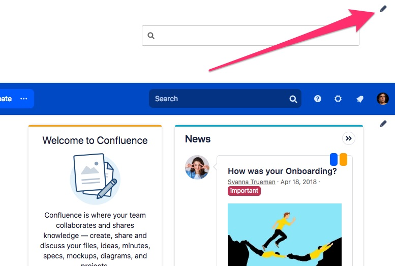
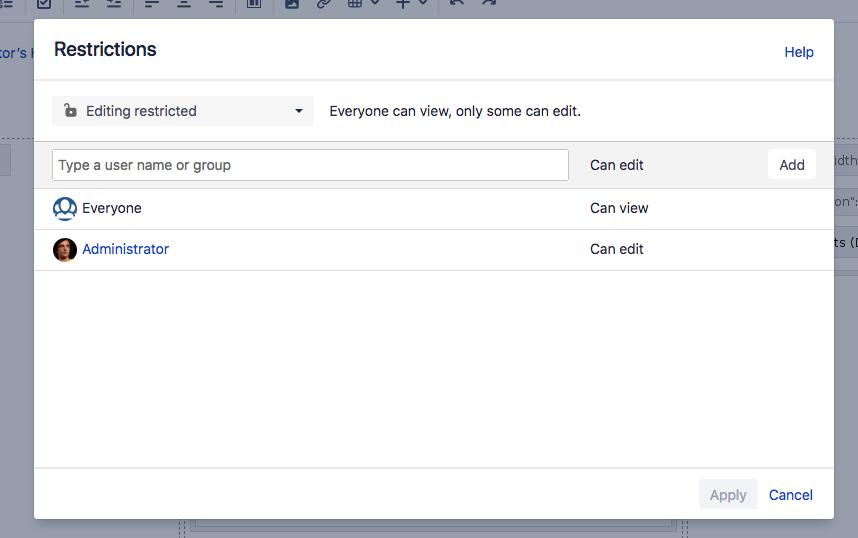
By default, every Confluence administrator can see the edit icon and is able to edit the element until the page is created (see below).
Creating the Custom Element Page
In order to edit any of the custom elements, a Confluence page needs to be created. The first time clicking the edit icon, you will be presented with a dialog to create the Confluence page. It can be in your personal space, or in any space you like.
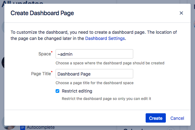
If you restrict editing of the page, you will be the only person who is allowed to edit it. You can of course edit the page restrictions to allow additional users to edit the page. They will then also see the edit icon of the particular custom element.
From now on, if you click the edit icon, you will be redirected to the edit mode of the dashboard page.
Removing or Setting Another Custom Element Page
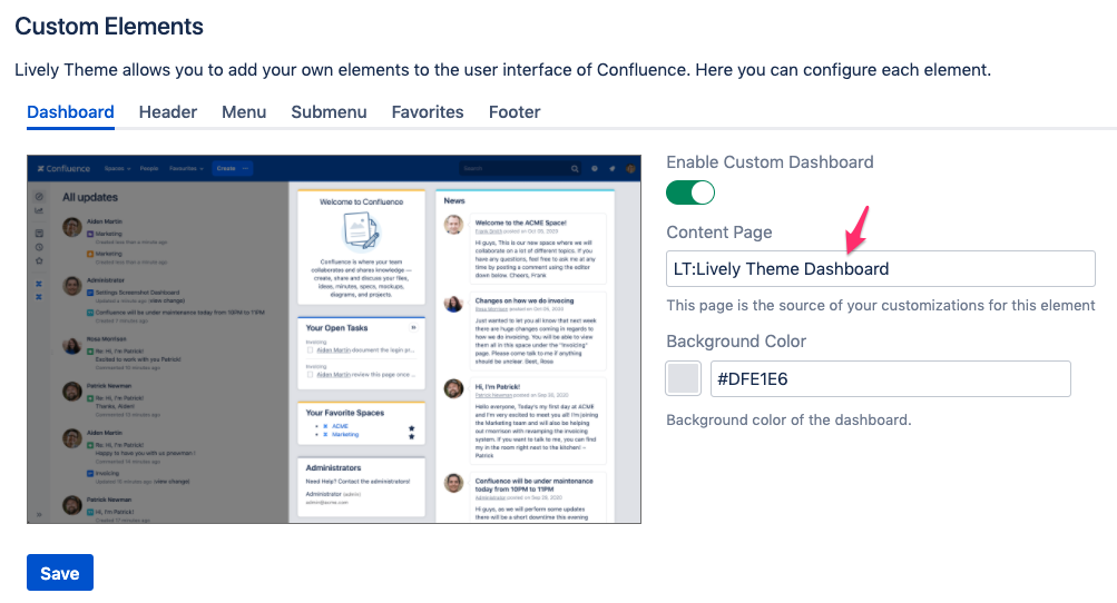
If you go the Confluence Administration → Lively Theme → Settings you can remove the page for each custom element or choose a different one (below is an example for the Dashboard element).
Background Colors
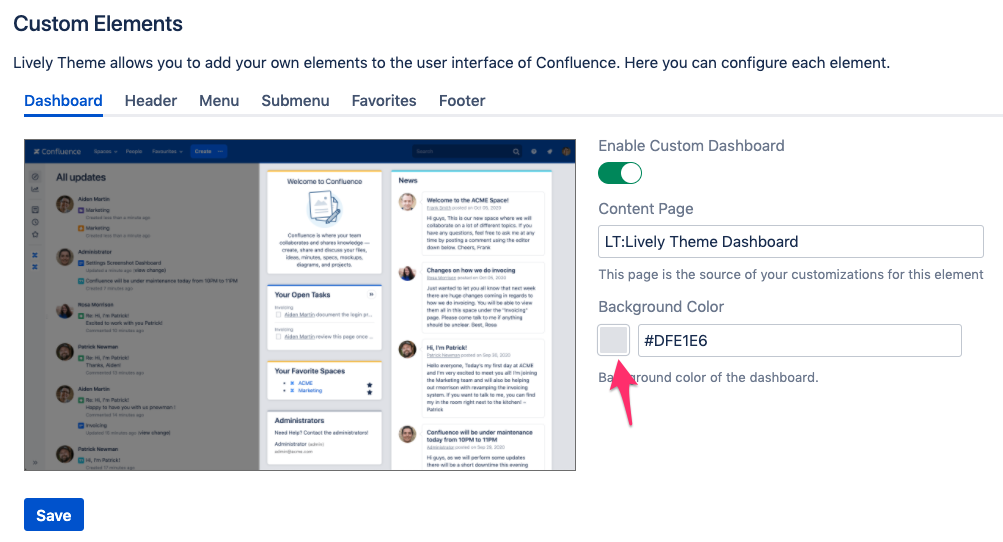
The background color can be changed for every custom element. Go to Administration → Lively Theme → Settings and chose a color with the color picker or enter a hex value manually (below is an example for the Dashboard element).
Macros
Widget Macro
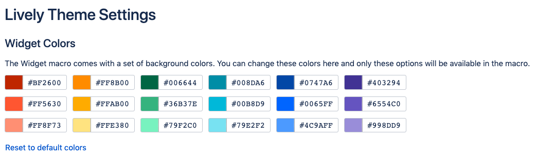
The Widgets macro is used on the dashboard page by default but it can also be used on any Confluence page. It will show a title and content in an attractive widget with a colored top bar. The available colors of the top bar can be configured in the Lively Theme settings:
Macro Parameters
Attribute | Default Value | Description |
|---|---|---|
Title | none | The title of the widget. 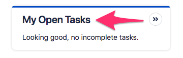 Can be any text. Example: My Open Tasks |
Color | gray | The widget top color.  There is a default color palette to chose from. These colors can be changed in the Lively Theme settings (see screenshot above the table). |
Content Style | widget | The style that should be applied to the content. By default the "widget" style applied to make popular macros and content elements like tables better fit into a widget. The option "menu" adds styles to make lists and tables look more like a menu and "expand-menu" allows creating menus with the Expand macro. The option "none" will apply no style and the Confluence content will be displayed as it is. Examples for content style "widget" Tasklist maco before:  Tasklist maco after: 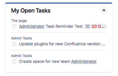 Table before: 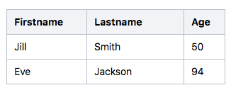 Table after: 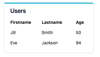 Examples for content style "menu" Table with icons before: 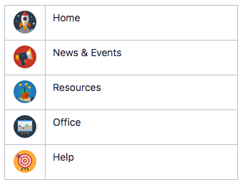 Table with icons after: 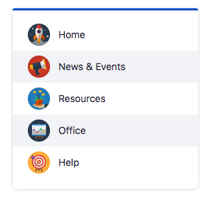 Examples for content style "expand-menu" Table with Expand macro before: 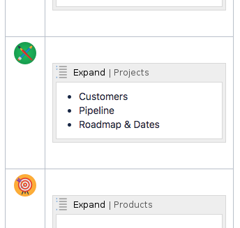 Table with Expand macro after: 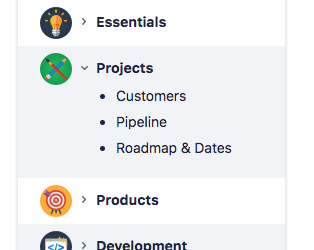 |
Hidden | unchecked | Indicates whether the widget should be displayed or not. |
Custom CSS | If you specify a value for this field, a class |
Advanced Parameters
Attribute | Default Value | Description |
|---|---|---|
Actions | none | Further actions are links that are displayed with an icon on the top right of a widget. 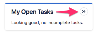 Actions are defined as a JSON array of action objects. See the table titled “Actions JSON Attributes” below for more info. Example:
CODE
|
Macro Parameters | none | Comma separated list of a key-value pairs separated by a colon. Allows to set macro parameters of macros inside the widget. It is used for example to set the current user in the task report macro. Example: assignees:@currentUser |
Hide Selector | none | A CSS selector to hide element inside the widget macro if they should not be displayed inside the widget. |
Actions JSON Attributes
Key | Description |
|---|---|
type | Only "link" is accepted as a type at the moment. Example: link |
link | The link where the action should point to. This can be an external link (http://...) or an internal link. Example: /plugins/inlinetasks/mytasks.action |
icon | The AUI Icon code. Example: arrows-right |
title | The title of the action. Can be any text. Example: Tasks |
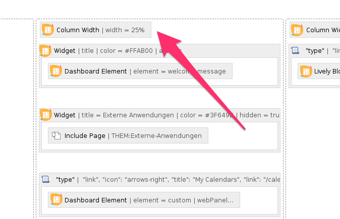
Column Width Macro
The Column Width macro can be used to customize the width of a section column. Just place it anywhere inside the section. Use a percentage or a pixel value for the column width. Example: 25%
Confluence Element Macro
The Confluence Element macro can be used to display Confluence elements like the all-updates stream, the welcome message, or the footer.
With the option "dashboardPanelSelector", a CSS selector can be provided that matches a Confluence web panel that is used on the dashboard. Example: .new-dashboard-calendar-container for the Team Calendars panel.
Margin Macro
The Margin macro allows to add a margin to the content contained inside the macro.

The margin is provided in CSS syntax (top right bottom left), so for a top margin of 50 pixels and a right margin of 60 pixels, the value is 50px 60px 0 0.
List Macro
The List macro generates the following 3 lists.
List Type | Description |
|---|---|
recentlyViewedSpaces | A list of the max. 10 recently viewed spaces of the current user. |
favouriteSpaces | A list of the users favourite spaces. |
favouritePages | A list of the users favourite pages. |
spacesByCategory | A nested list of spaces by category. The categories are provided by a comma separated list. If there is only one category, just a simple list of spaces is returned. |
Menu Macro
The Menu macro generates a vertical or horizontal AUI (Atlassian User Interface) menu from a list. If the list is nested, a nested menu will be generated. Additionally a max. width or height in pixels can be provided to restrict the width or height of them menu.
Examples:
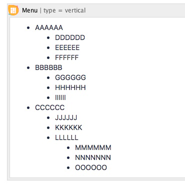
List in the editor
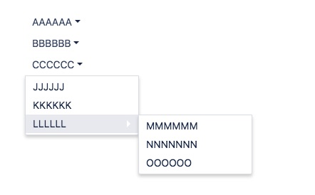
Vertical menu
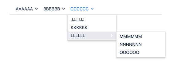
Horizontal menu
Button Macro
The Button macro allows to add AUI (Atlassian User Interface) buttons in normal or primary style and with or without icon to the content. The link can be a page, an external resource or an anchor.
Example (title: My Button, icon: weblink):
Regular Button | Primary Button | Regular Button with Icon | Primary Button with Icon |
|---|---|---|---|
 | 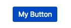 |  |  |
Widget Examples
Name | Screenshot | Content | Content Style |
|---|---|---|---|
Welcome Message |  | Confluence Element macro Element: welcome-message | widget |
My Open Tasks | 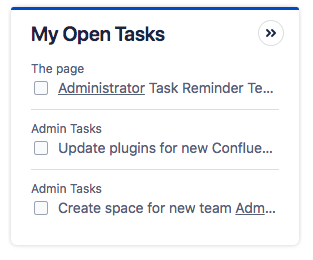 | Task Report macro | widget |
News | 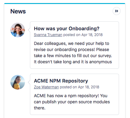 | Blog Posts macro | widget |
Calendar | 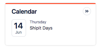 |
Confluence Team Calendars must be installed. Confluence Element macro Element: dashboard-panel Web Panel Selector: .new-dashboard-calendar-container | widget |
Questions | 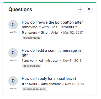 |
Confluence Questions must be installed Question List macro | widget |
Administrators | 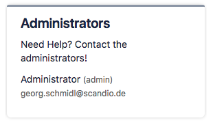 | User List macro Groups: confluence-administrators | widget |
Link Menu | 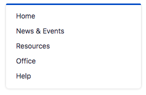 | Links, each in one line | menu |
List Menu | 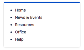 | Links in a list | menu |
Table Menu | 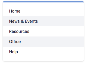 | Links in a table with one column | menu |
Icon Menu | 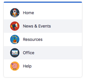 | Links in a table with one column | menu |
Expand Menu | 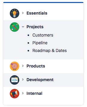 | Links inside the Expand macro | expand-menu |
Icon Menu | 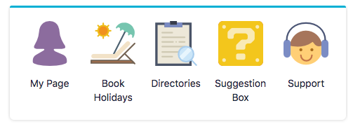 | Icons with text in a table with one row | widget |
Button Menu | 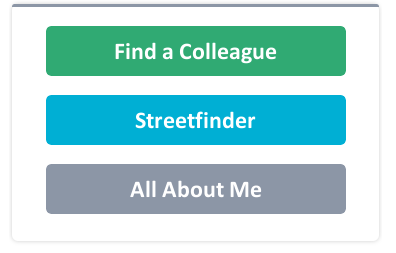 | Button images in a table with one column | widget |
Useful links
Our Service Desk is the best way to reach us if you have problems or would like to suggest a new feature.
Contact us by email via support@livelyapps.com.
Have a look at our other apps and discover more helpful tools