Column Chart With Formatted Numbers
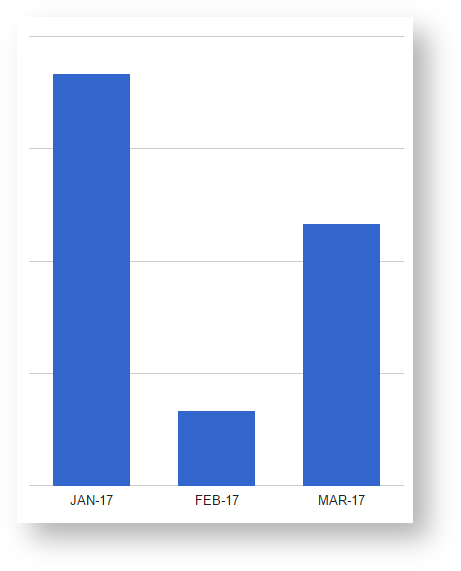
This column chart reformats the given values to use a decimal comma instead of a decimal point. It removes the labels on the vertical axis, still the exact numbers can viewed when hovering over the bars. Additionally, the chart is resized and repositioned to remove some of the wrapping white space.
CODE
<script>
PocketQuery.chart('ColumnChart', {
  dataTable: [['Month', 'Value'], // adding dummy data for testing; remove this attribute for productive use
        ['JAN-17', 52.1],
        ['FEB-17', 51.2],
        ['MAR-17', 51.7]],
  width: 500,
  height: 500,
  chartArea: {left:100, top:10, width:"75%", height:"90%"},
  format: {
    type: 'NumberFormat',
    column: 1,
    options: {
      decimalSymbol: ',',
      groupingSymbol: '.',
    }
  },
  vAxis: {textPosition: 'none'}     // removing labels on horizontal axis
});
</script>