Customizing the Appearance of Your Query With a Template
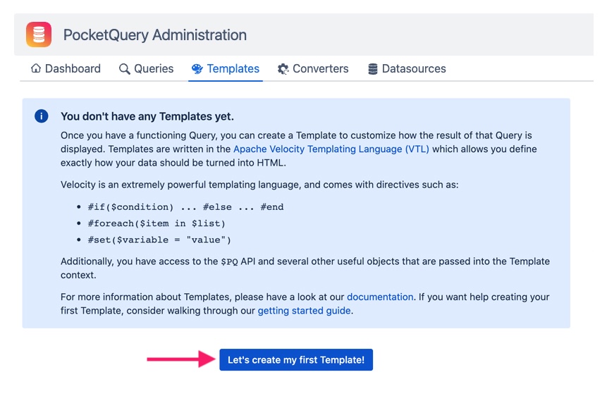
In PocketQuery, you have full control over how your data should be presented. After your data is fetched from your Datasource, and processed by a Converter, it is piped into a Template. The Template is responsible to render your data into HTML which can then be displayed in a Confluence page. So, let’s go to the Templates tab and create one:

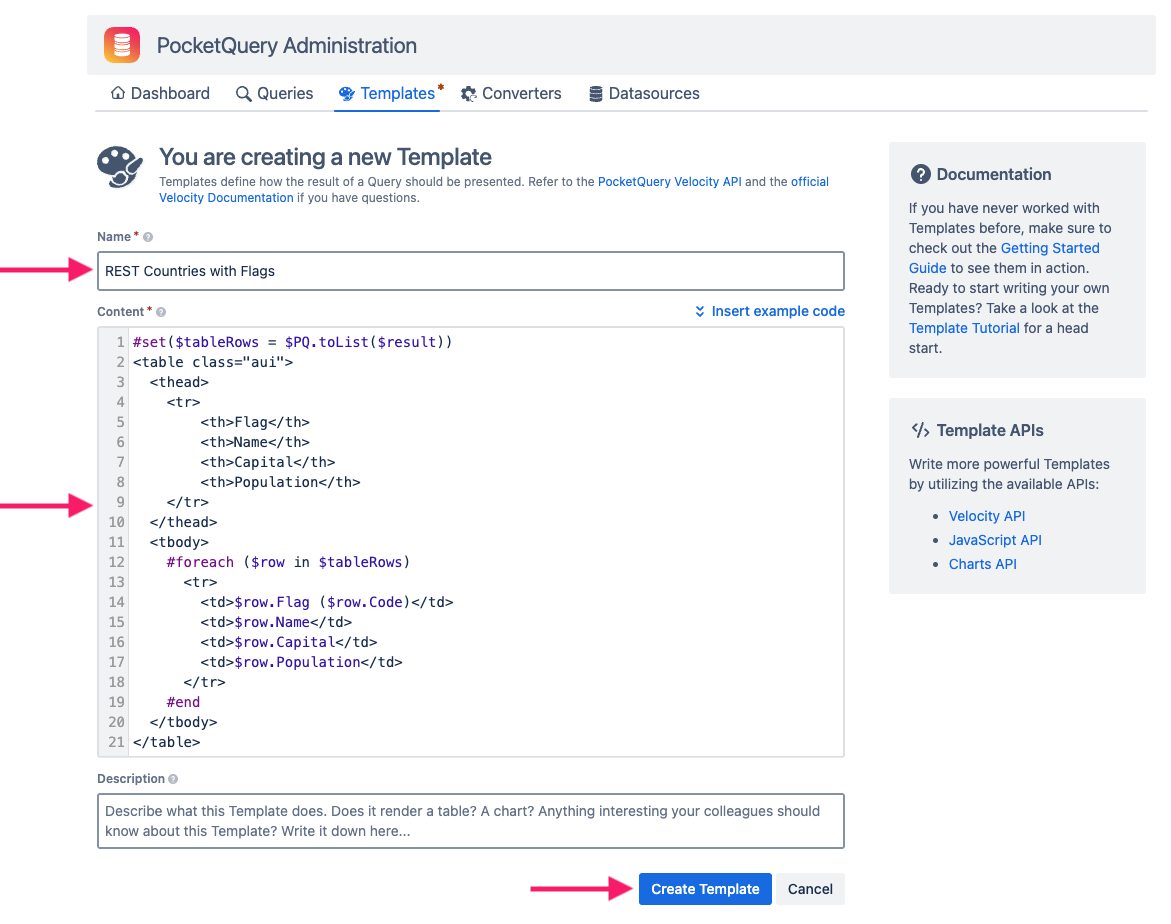
Similarly to Converters, Templates are code snippets written in the Velocity Templating Language (VTL). VTL comes with some powerful features such as loops, conditionals, and variables. You can see the code that we are going to use for this Template below. For this template, imagine that we want to display the country’s code in parenthesis behind the flag (rather than in its own column). As seen below, we don’t include <th> and <td> elements for the code, but rather add it inside the <td> tag for the flag.
#set($tableRows = $PQ.toList($result))
<table class="aui">
  <thead>
    <tr>
		<th>Flag</th>
		<th>Name</th>
		<th>Capital</th>
		<th>Population</th>
    </tr>
  </thead>
  <tbody>
    #foreach ($row in $tableRows)
      <tr>
	  	<td>$row.Flag ($row.Code)</td>
		<td>$row.Name</td>
		<td>$row.Capital</td>
		<td>$row.Population</td>
      </tr>
    #end
  </tbody>
</table>
Name your Template, paste the code into the editor and click Create Template:

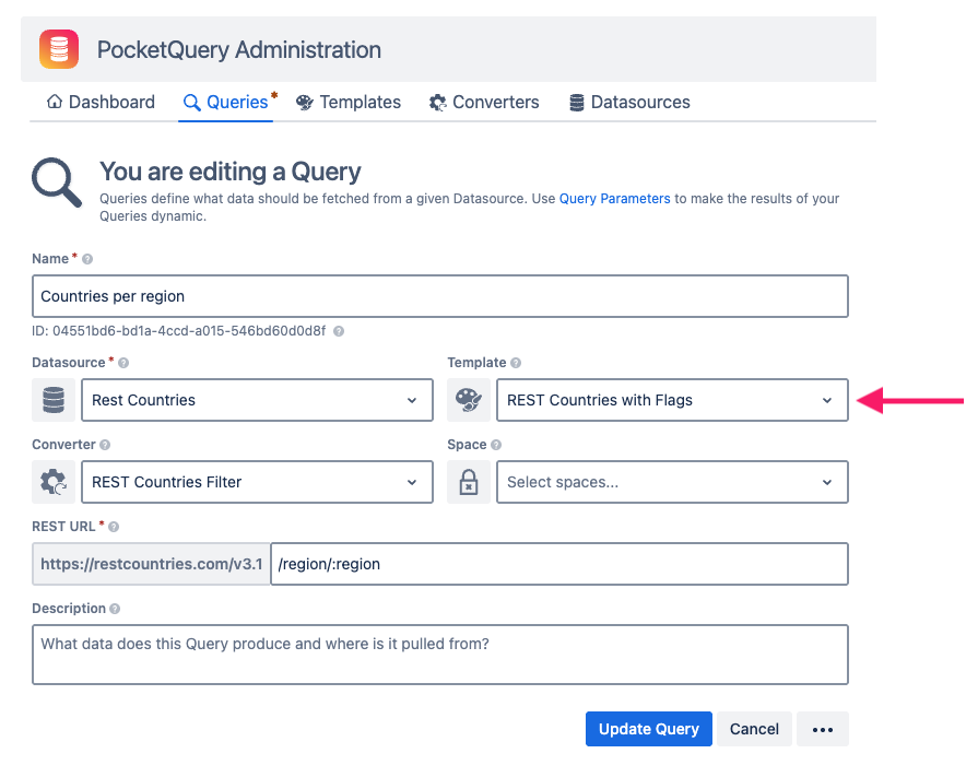
Just like with our Converter, we then need to tell our Query to use this Template:

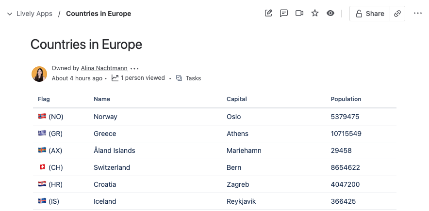
Update your Query, return to your page, and see for yourself:

As you can see, you can render arbitrary HTML with PocketQuery, which means in Templates you can do just about everything that you can do on a normal website! 🚀
And what do the coolest websites all have in common? Exactly, charts! So, flags are nice and all, but if you want to learn how you can use PocketQuery to present your external data as charts inside Confluence pages, you just need to read the last part of our Getting Started Guide!
Continue with “Visualizing Your PocketQuery Results With Charts“
